 |
|
|
||||||||||||||||||||
|
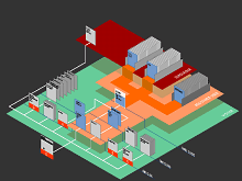
Web Site Maps from Dynamic Diagrams "Where am I?" This is a question asked by most of us when we get dumped into the middle of a large Web site by a search engine, often followed by, "What else is available on this site?" and, "How do I get there?" The Web site map is one of the key tools that site designers can provide to help surfers answer these questions and successfully navigate through their site. However, the art and science of creating intuitive and useful Web site maps is still in its infancy. There are a panoply of different Web site maps out there, ranging in graphical style and sophistication, from the simplest text indexes and 'table of contents' ones (see the Mappa.Mundi site map for example), to all manner of handcrafted clickable diagrams and fancy interactive maps [1]. Despite all the fascinating examples, too many fail in the hard-nosed reality of actually guiding disorientated surfers to their destination. There is the perennial problem of what level of detail to display on the map; how can you show local detail for practical navigation, whilst also giving the global context of the site. There are so many possible elements to describe a site that could be represented on a map - title, URL, screen-grabs, depth from home, access restrictions. The maps themselves need to be quick loading and are constrained in what they can show by standard screen resolutions. Then there are the problems of keeping maps up to date on a fast changing site. One of the most knowledgeable people in the nascent field of Web site mapping is Paul Kahn, a founding partner in the information design firm, Dynamic Diagrams. In a recent e-mail, Kahn said, "I think web site mapping is bouncing back and forth between two poles: it is absolutely necessary and it is impossible." On the one hand maps are vital for giving people a familiar visual overview of a new, unknown territory - the Web site. And yet, they are so hard to produce. Dynamic Diagrams, Inc. has developed an innovative visual metaphor to represent Web site structure which they call the Z-Diagram. It is a 2.5d landscape view, with Web pages represented as small standing cards. The metaphor was originally conceived by Krzysztof Lenk, a designer and founding partner in the company, to display the structure of a multimedia encyclopaedia [2]. Detailed, handcrafted, Z-Diagrams are widely employed by Dynamic Diagrams as planning maps in their work designing and redesigning large Web sites. The figure below shows an example produced to map the key structures of the design of the new Nature Neuroscience Web site [3]. The hierarchical structure, volume of pages, click-depth of pages, and access rights are all clearly mapped using a combination of spatial layout and strong colour coding. Page cards are laid out from bottom-left to top right showing progressive click depth into the site from the home page. Simultaneously, different colour-coded carpets, that get progressively higher on the map, designate different levels of access (visitor, registered user and subscriber).
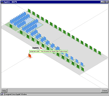
The Z-Diagram lays out the site on an isometric plain which has a constant scale across the space. Kahn says the Z-Diagram was influenced by the famous Turgot map of Paris from the 1730s [4] which employed the same geometric properties to provide legible views of the crowded Parisian streets. And he argues, Dynamic Diagrams have also used a basic Z-Diagram metaphor in an interactive site map for surfers [5]. Their system is called MAPA and users can request a simple Z-Diagram style map from any page on a Web site and it will be displayed in a small pop-up window showing the local structure. An example of the MAPA maps is given in the figure below. Importantly, the MAPA system also provides 'back-end' tools to analyse the structure of a large site and derive the key hierarchical structure, which is stored in a database from which the maps can be generated at the request of the user. MAPA is, therefore, a data-driven Web site map rather than a handcrafted one. The figure shows a screen-shot of the MAPA map of part of the Javasoft Web site, with cards projecting vertically from the ground plain representing the pages. The cards are spatially arranged on the ground to reflect the dominant hierarchical structure of the site without cluttering the screen with multiple hyperlinks between pages. Different colour carpets delineate different levels in the hierarchy.
Our location is shown, at the bottom-left, by the white card with a red marker. In the figure, we are located on the 'Applets' Web page and to our right are further pages in the site hierarchy. Cards are ordered towards the top-right corner of the map, and each layer represents a step deeper into the site. All child pages from our location are shown on the map and they are equally spaced along a horizontal diagonal line so they are spread out without overlap. Further pages below these pages are spaced behind in parallel rows. The number of rows gives an instant and intuitive visual indication of the volume of pages from our location. Even though some of these cards do overlap to varying degrees, at least part of them is still visible to the user and can be queried using the cursor. Simple colour coding is also used to further identify hierarchical structure, so immediate child pages are shown in green and further grandchild pages are blue. Below our location card, toward the bottom-left, ancestor pages are shown by orange coloured cards which delineate the steps back to the site's home page (note, in the figure there is one ancestor page - the site homepage). Users can interact with the MAPA map in several ways. Firstly, passing the cursor over a card will cause it to be highlighted and for the title to be displayed as a flag. Titles are displayed in such a manner that they are all visible with minimal overlapping. Users can also navigate within the map itself by re-focusing the layout around a different page. This is achieved by clicking on the cards with a dark bar on them and the pages rearrange themselves in a smooth animated transition. This is one of the key "wow factors" of MAPA according to Kahn, who comments,
The MAPA system provides one of the most innovative and effective interactive Web site maps currently available [6]. As the field of Web site mapping matures there will be many new examples which will, hopefully, help the user answer the question "Where am I?" Copyright © 1999, 2000 media.org. ISSN: 1530-3314 |
|||||||||||||||||||||


|