 |
|
|
|||||||||||||||||||||||||||||||||||||||||||
|
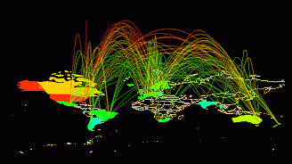
Missile Tracks Across The Net One of the great urban myths concerning the origins of the Internet is that it was designed to survive a Soviet nuclear strike through its distributed structure. This month's map reminds me of this myth as it looks like ballistic missile tracks displayed on some NORAD radar display [1]. The world is encompassed by a fountain of arcing trails, streaking from country to country in some global Armageddon. In fact, this striking 'arc map' is a visualization of Internet traffic flows between nations. The arc map was created by visualization researchers at Bell Laboratories-Lucent Technologies, in Naperville, Illinois. Key researchers in the Bell Labs team are Ken Cox, Taosong He and Graham Wills, with leadership from Stephen G. Eick [2]. The map has a particular power and beauty. And it is fast becoming one of the iconic representations of the Internet, widely employed to answer a basic question - what does the Net look like? [3]
The arc map displays a 3D network structure as arcs curving smoothly above a flat map of the world. The data being visualized is Internet traffic flows between fifty countries, as measured by the NSFNET backbone in 1993. The colour, thickness and height of the arcs is used to encode the traffic statistics for particular inter-country links. The arcs are also partially translucent so as not to completely obscure lines at the back of the map, while their height above the base map is in relation to total volume of traffic flowing over a link. This has the effect of making the most important (high traffic) links, the highest and therefore most visually prominent on the map. The user has considerable interactive control over the arc map, for example the arc height scaling and translucency can be varied. The map can also be rotated and scaled, so that the user can view it from any angle [4]. The Bell Labs visualization group has done pioneering work in the mapping of communication network traffic for the past decade, experimenting with a number of different 2D and 3D spatial representations [5]. They developed specialised visualization applications called SeeNet and SeeNet3D to produce their interactive maps. The SeeNet visualization toolbox produces link-node maps of network traffic on a 2D geographic framework (see my June 1999 column on the ARPANET map for background on link-node network maps). There are limits to the size and complexity of the networks that can be visualised with the 2D link-node maps of SeeNet due to visual clutter. To overcome this, Eick and his colleagues have explored novel 3D spatial metaphors to map networks using the SeeNet3D. One approach mapped the node-link structure onto a globe, producing results similar to the MBone visualization created by Tamara Munzner and colleagues (see my August 1999 column). SeeNet3D also produced the arc map. In addition to mapping network structures and traffic, the researchers at Bell Labs are interested in many other aspects of information visualization (see sidebar), including applications in data mining of large databases [6] and visualization of software source code. The commercial potential of their visualization research is being developed through a spin-off company called Visual Insights, started at the end of 1997, with Eick as chief technical officer. When I asked Stephen Eick recently, via e-mail, about the arc map he put its success as iconic symbol down to the simple fact that "this particular visualization is exciting and visually appealing." This is certainly true, but I also think part of the iconic power of the arc map derives from the fact it fits people's imagination of what the Net should look like, drawing on the popular conceptions of global spanning networks. Eick himself is somewhat nonplussed by the popular appeal of his network visualizations, "Frankly, I'm amazed and delighted that anyone outside the communications equipment and service providers much cares about Internet mapping." Yet, the arc map is one of the best examples of a representation of the Net that goes beyond the practical and taps into a deeper aesthetic feel for what cyberspace looks like. Copyright © 1999, 2000 media.org. ISSN: 1530-3314 |
||||||||||||||||||||||||||||||||||||||||||||


|