 |
|
|
||||||||||||||||||||||||||||||||||||||||
|
What Does the Internet Look Like, Jellyfish Perhaps?
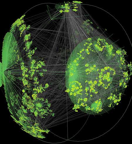
The Internet is often likened to an organic entity and this analogy seems particularly appropriate in the light of some striking new visualizations of the complex mesh of Internet pathways. The images are results of a new graph visualization tool, code-named Walrus, being developed by researcher, Young Hyun, at the Cooperative Association for Internet Data Analysis (CAIDA) [1]. Although Walrus is still in early days of development, I think these preliminary results are some of the most intriguing and evocative images of the Internet's structure that we have seen in last year or two. A few years back I spent an enjoyable afternoon at the Monterey Bay Aquarium and I particularly remember a stunning exhibit of jellyfish, which were illuminated with UV light to show their incredibly delicate organic structures, gently pulsing in tanks of inky black water. Jellyfish are some of the strangest, alien, and yet most beautiful, living creatures [2]. Having looked at the Walrus images I began to wonder, perhaps the backbone networks of the Internet look like jellyfish?
The image above is a screengrab of a Walrus visualization of a huge graph. The graph data in this particular example depicts Internet topology, as measured by CAIDA's skitter monitor [3] based in London, showing 535,000-odd Internet nodes and over 600,000 links. The nodes, represented by the yellow dots, are a large sample of computers from across the whole range of Internet addresses.
Walrus is an interactive visualization tool that allows the analyst to view massive graphs from any position. The graph is projected inside a 3D sphere using a special kind of space based hyperbolic geometry. This is a non-Euclidean space, which has useful distorting properties of making elements at the center of the display much larger than those on the periphery. You interact with the graph in Walrus by selecting a node of interest, which is smoothly moved into the center of the display, and that region of the graph becomes greatly enlarged, enabling you to focus on the fine detail. Yet the rest of the graph remains visible, providing valuable context of the overall structure. (There are some animations available on the website showing Walrus graphs being moved, which give some sense of what this is like.) Hyperbolic space projection is commonly know as “focus+context” in the field of information visualization and has been used to display all kinds of data that can be represented as large graphs in either two and three dimensions [4]. It can be thought of as a moveable fish-eye lens. The Walrus visualization tool draws much from the hyperbolic research by Tamara Munzner [5] as part of her PhD at Stanford. (Map of the Month examined some of Munzner's work from 1996 in an earlier article, Internet Arcs Around The Globe.) Walrus is being developed as a general-purpose visualization tool able to cope with massive directed graphs, in the order of a million nodes. Providing useful and interactively useable visualization of such large volumes of graph data is a tough challenge and is particularly apposite to the task of mapping of Internet backbone infrastructures. In a recent email Map of the Month asked Walrus developer Young Hyun what had been the hardest part of the project thus far. “The greatest difficulty was in determining precisely what Walrus should be about,” said Hyun. Crucially “... we had to face the question of what it means to visualize a large graph. It would defeat the aim of a visualization to overload a user with the large volume of data that is likely to be associated with a large graph.” I think the preliminary results available show that Walrus is heading in right direction tackling these challenges. However, Hyun points out that it is still early days and over the next six months or so Walrus will be extended to include core functions beyond just visualizing raw topology graphs. For CAIDA, it is important to see performance measurements associated with the links; as Hyun notes, “you can imagine how important this is to our visualizations, given that we are almost never interested in the mere topology of a network.” Walrus has not revealed much new scientific knowledge of the Internet thus far, although Hyun commented that the current visualization of topology “did make it easy to see the degree to which the network is in tangles how some nodes form large clusters and how they are seemingly interconnected in random ways.” This random connectedness is perhaps what gives the Internet its organic look and feel. Of course this is not real shape of the Internet. One must always be wary when viewing and interpreting any particular graph visualization as much of the final “look and feel” results from subjective decisions of the analyst, rather than inherent in the underlying phenomena. As Hyun pointed out, “... the organic quality of the images derives almost entirely from the particular combination of the layout algorithm used and hyperbolic distortion.“ There is no inherently “natural” shape when visualizing massive data, such as the topology of the global Internet, in an abstract space. Somewhat like a jellyfish, maybe? Copyright © 1999-2001 media.org. ISSN: 1530-3314 |
|||||||||||||||||||||||||||||||||||||||||
|


