|
|
���Show Me The Money: The Map of the Market
Understanding the daily fluctuations in the stock market is a serious business for traders, analysts and investors. There is money to be made in those fluctuations and the Map of the Market is one of the best visualization tools around: it can show the changing stock prices of over 500 publicly-traded companies on a single screen. Since its launch by SmartMoney.com at the end of 1998, the Map of the Market has become a firm favourite with users. This is due, in large part, to the fact that it presents large volumes of fast changing data in a very useful and usable format, providing people with answers to the basic question 'how is the market doing today?' at a single glance. It is probably the most useful exemplar of information mapping on the Web today and is well worth trying out if you've never used it [1]. On one single map one can quickly gain a sense of the overall market conditions, yet still see many hundreds of individual data elements.
|
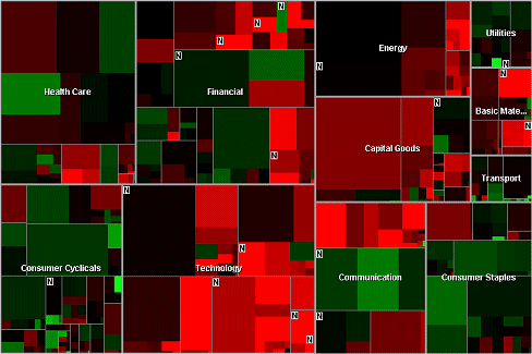
The Map of the Market. Screengrab taken on 16th July 2001.
(Courtesy of SmartMoney.com)
| |
| Size, Colour and Position |
|
Map of the Market uses a visualization technique known as Treemaps [2], which provides a compact and elegant means of showing several attributes of large number of objects. Using a display of coloured rectangular tiles, Map of the Market shows the performance of the most important companies on the US stock market updated every fifteen minutes. In the map each tile represents a single company, with the size of the tile being proportional to its market capitalization. So, the larger the tile, the greater the value of the company. This allows the value of different companies to be assessed by simply comparing the size of their tiles. The colour of the tile encodes the change in the company's stock price over a set time period. In the default colour settings the red colouration shows a declining stock price, while green shows positive growth. Black indicates no change. The stronger the saturation of colour, the stronger the percentage stock price change (either negative or positive).
The position of the tiles in the map also conveys useful information. Firstly, companies are arranged into eleven major sectors and then further grouped by industry type. The particular spatial layout of tiles within the industry block tries to cluster companies as close together as possible, based on historically similar stock price movements, the idea being to create neighborhoods in the map which contain similarly-performing companies. (A similar spatial clustering technique was used in the ET-Map, a prototype category map of Web pages developed by researchers in the AI Lab at the University of Arizona [3].) So, on the Map of the Market you will often see distinctive spatial patterns of light and dark tiles which can reveal significant large-scale trends in stock prices.
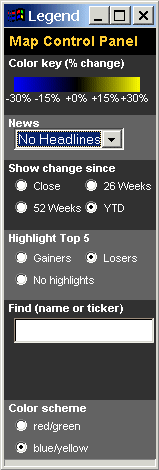
The map itself is a small Java applet and can be consulted on the SmartMoney.com site. (They also sell various different versions such as the standalone MapStation and Excel spreadsheet plug-in.). It is fully interactive, allowing the user to access a great deal of information, statistics and news on the companies by clicking on their tiles. A pop-up legend provides controls to change the colour scheme and a display of icons to show news on the map, highlight the top winners and losers and set the time period that determines the stock price colour coding. Users can also zoom into the map, to focus on a particular sector or industry of interest, as can be seen in the example screengrab below.
|
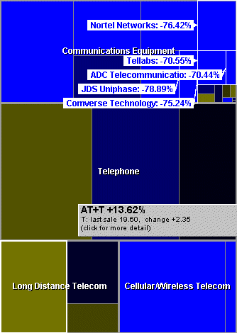
|
The alternative yellow-blue colour scheme for communications sector of the
Map of the Market from the 25th July 2001. Also shown is the legend pop-up
and highlights of the top 5 losing stocks.
(Courtesy of SmartMoney.com)
| |
Map of the Market is the brainchild of Martin Wattenberg, the lead information designer working on financial data visualization at SmartMoney.com. In a recent email interview, Map of the Month asked him why he thought Map of the Market has enjoyed such a strong following. ܷI think [it] has succeeded for two reasons,” he said, “first, it communicates a huge amount of live data that is important to many people. Second, we spent a lot of time getting the details right - working on exactly how the pop-up menu should function, how the mouse over labels should look, what color schemes to use, etc. Since the basic scheme is so unusual, it was critical that we make the user experience as comfortable as possible.”
Wattenberg is based in Manhattan, and in addition to developing visualizations for SmartMoney.com, he teaches interactive design at Columbia University and is a talented digital artist at the forefront of net art. Wattenberg's forays into art usually focus on creating novel interactive user interfaces to information, for example his astronomically-inspired Spiral interface or The Shape of Song [4]. And a recent work called Apartment (co-created with Marek Walczak) was shown at the Whitney Museum of American Art as part of the Data Dynamics exhibition in June 2001 [5], as well being nominated for a Webby award. Wattenberg has also adapted the Map of the Market style of interface for the Smithsonian Institution as means to explore their online collection [6]. Perhaps surprisingly Wattenbergs background is in mathematics, with a PhD from UC Berkeley, rather than art or design, but as he says, “mathematicians love to create diagrams to explain their thinking.” To judge from his growing body of work, he certainly seems to have talent for novel visual thinking.
|
|
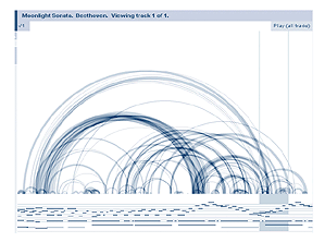
Examples of Martin Wattenbergs artistic work.
On the left is a screengrab of the Spiral interface and the right image
shows The Shape of Song visualizing the structure of Beethovens Moonlight Sonata.
(Spiral is courtesy of Rhizome and The Shape of Song is courtesy of Turbulence)
| |
The world of stocks and shares is also a good domain to work on, “financial activity is so complex that those diagrams ended up turning into full-blown map,” says Wattenberg. Similar information mapping techniques are also being applied to the arguably more challenging task of summarizing and searching large collections of documents on intranets or the Web. A notable example was the Themescape system sadly no long in operation [7]. More recently Antarctica Systems and WebMap Technologies launched large-scale information maps of the core of the Web, based on the several million sites categorized by the Open Directory [8].
Wattenberg is cautious but hopeful of the potential of information mapping, saying, “I haven't yet seen a map of the entire web that was easy to understand, but I believe that someone will make one soon!” Map of the Month asked Wattenberg what this map might be like,
My dream web map would be closely tied to my dream search engine. As it happens, my dream search engine already exists, and it's called Google. So my map would be an add-on to Google, and it would show me how the sites that matched my searches were related. I have many ideas about how this could function, so if anyone from Google is reading this they should drop me a line!
Copyright © 1999-2001 media.org.
ISSN: 1530-3314
|
|