 |
|
|
||||||||||||||||||||||||||||||||||||||||
|
Mapping how people use a website
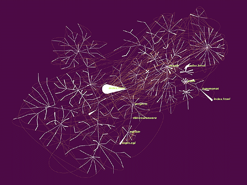
A major challenge in designing and operating a large website is understanding how people use your site. Obviously, server logs for the site provide a potentially rich vein of information, as they record all user requests for pages. But how to make sense of this data so that the dynamic interactions of visitors and the Web page structure can be understood? Some form of mapping of these interactions to make them visible could well prove useful in turning the raw data in the logs into useful information. However, techniques and tools to visualize dynamic processes like Web usage are poorly developed. In this issue of Map of the Month we look at the work of one of the leading researchers trying to overcome this weakness, through the use of the concept of organic information design. His name is Ben Fry and he works in the MIT Media Lab, where he is busy creating innovative adaptive visualizations of how people use websites [1]. We focus on one particular visualization system developed by Fry called anemone. It shows how people use a website by integrating page structure and dynamic usage data via a simple visual metaphor of a branching, growing organism. Individual web pages are shown as simple white tentacle-like nodes, giving rise to an appearance somewhat like a sea anemone, as can be seen in the example screenshot below. (Although, sea anemones have a very plant like appearance, they are, in fact, invertebrate animals [2]).
Anemone is one of the most interesting new generation of interactive website maps, but there are many different types of website maps to meet a range of requirements from site planning and development, routine maintenance and end-user navigation. Some of these have been covered by previous Map of the Month articles [3], and Paul Kahn, information designer at Dynamic Diagrams, provides a nice thematic review of the field in his recent book, called unsurprisingly - Mapping Web Sites [4]. Some website maps are commercial products, but many are research prototypes or graduate student projects. Anemone is a research prototype at present, but its role would be as an analytical tool for website managers seeking tactical intelligence on how their site is really being used.
What is organic information design, the underpinning concept of Ben Fry's visualization research? In a short email interview in April 2001, Map of the Month asked Fry about his motivations. “I'm consumed with studying the structure and form of information. Ways to see and feel relationships and values and structures. I'm interested primarily in finding ways to respond to continually changing data. ” When asked for a layman's definition of organic information design, Fry explained, “One way to look at it is that I make a software program that I can 'feed' data to, and watch how the data is digested. Ben Fry is currently a full-time researcher in the Aesthetics and Computation group (ACG) at the Media Lab, having completed his masters degree there in 2000. His background is an interesting mixture of hard computer science and graphic design that became integrated in his undergraduate studies at Carnegie Mellon University. At the Media Lab Fry is supervised by John Maeda, a leading light in interactive digital design through the MAEDASTUDIO [5] and the ACG [6]. (If you have a spare ten minutes it is well worth taking a browse around the web pages of other researchers in the ACG there are many fascinating and weird projects underway.)
Anemone reads website usage log and sequentially maps the activity recorded as a two-dimensional visualization to reveal which pages people visit. Once a page is visited it is represented as a simple white tentacle-like node on the map. These nodes are connected together by branches showing the underlying hyperlink structure. The hyperlink structure is cleverly inferred from the usage data, rather than having to run a separate spidering program. The tentacle nodes quickly grow fatter and fatter as more visitors hit that page, thereby making themselves visually prominent on the map. It is important to realize that the anemone map shows only those parts of the site that receive visitors, which makes sense as this is the active site, but it can result in disconnected sections on the map.
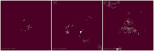
For a popular website, complex, branching, tree-like structures quickly grow as more usage data is feed into anemone, as can be seen in the sequence of screenshots above. These images were generated on the 6th of June, from real usage data from the Aesthetics and Computation group's website (you can try this out for yourself using the anemone demonstrator [7]). To balance the simple organic rules directing the growth branches, an atrophying rule also operates. This rule reverses the growth, so that when web pages stop receiving visitors, their nodes slowly shrink and visually wither away. Ultimately, the atrophying causes unvisited nodes to disappear from the map, the logical extension in the organic paradigm. Other simple rules operate to place and move branches of the anemone structure dynamically so neighbors are close to each other, but avoiding overlapping as far as possible. These dynamic rules result in a map display that jiggles and wobbles around as the anemone branches constantly try to reach a state of equilibrium. Map of the Month asked Fry what the hardest part in developing anemone was, “the tougher part is refining it enough so that it clearly points to the set of concepts around organic info design (representing dynamic data, a visualization that reacts and responds to data) rather than "hey, it's a map of the web! it's pretty!" Communicating the ideas beneath is very difficult. ”Anemone can give a very fine grained view of what is happening on a site, highlighting patterns and relationships across time and across the structure of web pages. Although there are a great number of different usage log analyzers on the market [8], they generally fail to communicate these patterns, instead they blind people with an overwhelming array of tables, numbers and bar charts. Other notable research in the field of website usage mapping includes the suite of analytical and visualization tools being developed by Ed Chi and colleagues in the User Interface Research Group at Xerox PARC [9] and the VISVIP tool developed by John Cugini and Jean Scholtz in the Visualization and Usability Group of the National Institute of Standards and Technology [10].
In conclusion, we return to the recurring theme of Map of the Month - that of the value and importance of mapping and visualization in understanding the nature of the web. When this issue was put to Fry, his unequivocal answer was, “they must, what else is there? :) Fry's ultimate dream map of the Net would apply the organic information design paradigm to smoothly summarize the vast richness and complexity of online activity, providing an almost omnipotent overview of the whole. He elucidated his vision of this 'map' as follows: “start with [the] example of mapping all the MIT sites as one visualization, and expand hat out to all of the systems on the web, including all the other layers of traffic that go on top of that: not just http, but other protocols like ftp, smtp, smb, rtsp, etc. then layer on higher level information that say more about the meaning of what's being transmitted by those protocols (getting a web page, posting to a form, moving a large file, the user who checks eBay 15 times in an hour, sharing a library of mp3s, sending a 300000 spam messages, conversations that occur between instant messenger users, and their patterns on a daily basis or over weeks or months). then layer on how these all cluster together. then add another layer of higher level meaning, and cluster that together. where is the traffic coming from? how can you see an entire organization's network as an organism that is under attack? how do you see people infiltrating holes in the network? how do you take care of people's privacy in this all-visual world? how do you see while avoiding the temptation to become big brother? Copyright © 1999-2001 media.org. ISSN: 1530-3314 |
|||||||||||||||||||||||||||||||||||||||||


|