 |
|
|
||||||||||||||||||||||||||||||||||||||
|
MIDS Maps the Internet World
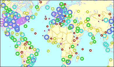
The longest serving cartographer of the Internet is undoubtedly John S. Quarterman. Through his research consultancy Matrix Internet and Directory Services[1] (MIDS), based in Austin Texas, he has been actively measuring, analysing and mapping the geography of the Net for the past decade. He got started, as he said in a recent e-mail, because "I like maps" and he was challenged to do the 'impossible' and map the whole Internet by locating Internet nodes on a geographic map. Quarterman has been working in computer networking since the 1970s and one of his earliest contributions to mapping the Net was his 1990 book, The Matrix: Computer Networks and Conferencing Systems Worldwide.[2] This book provided the first comprehensive survey of all manner of wide area computer networks at that time, not just the Internet. Hence, the title, The Matrix, a term coined by Quarterman to describe all the networks that could interconnect to exchange at least e-mail and therefore encompassing much more than just the vanilla TCP/IP Internet. (Note, this is not quite the same as the matrix in a recent Hollywood blockbuster film![3]) MIDS makes many different maps of the Internet. Perhaps the most striking is the world map showing the whole Internet in one snapshot. Their latest example, showing the state of the Internet in July 1999, is shown below [4]. It provides, I think, a no nonsense, way of presenting an overview of the global Internet on a single page, using the familiar framework of the continents and countries.
The cartographic approach employed by MIDS is to map the geographic locations of the Internet hardware (networked computers, known as hosts) as symbols on a world map. The number of hosts is aggregated for major cities and countries and then represented on the map by the coloured circles. The circles are proportionally sized so the larger the circle becomes, the greater the value it represents, which is intuitive and a widely used convention in cartography and statistical graphics. What can be discerned from this MIDS map about the geography of the global Internet in 1999? Most obvious and immediately striking are the super-clusters of circles in North America and Europe where is the Internet is clearly focused; though North America is dominant with purple circles representing a million or more Internet hosts, as compared to Europe which has more blue circles encoding smaller volumes of hosts. A definite north-south divide is evident at the global scale apparent from the map. Further interpretation, beyond getting this kind of global sense, is difficult because of overplotting symbols obscuring each other in densely-networked regions on this scale of map. MIDS cartographic design can be criticised, with particular concerns over the colour-ramp employed and the scaling of the circular symbol. The underlying data mapped is from the July 1999 Internet Domain Survey[5], which estimated there were 56.2 million computers connected to the Internet. MIDS takes this base data and performs time-consuming and rigorous geocoding on it to locate the Internet hosts as accurately as possible. In terms of mapping the whole Internet, a 'competitor' to the MIDS world map has recently emerged with Bill Cheswick and Hal Burch's Internet Mapping Project [6] which graphs out topology of thousands of interconnected Internet networks. Their huge graphs provide a global overview of the whole Internet in a single snapshot, but they choose to dispense with a real-world geographic framework and map their results in an abstract space. Whereas, Quarterman says that MIDS, "…tend more towards geographical maps because they have immediately recognisable context, because they're harder, and because we like them." This statement is, in many respects, the crucial argument for why cartography is such a powerful visual tool in understanding the Matrix. Copyright © 1999, 2000 media.org. ISSN: 1530-3314 |
|||||||||||||||||||||||||||||||||||||||
|


