 |
|
|
|||||||||||||||||||||||||||||||||||||||||||||||||||||||||||||||||||||||||||||||||||||||||||||||||||||||||||||||||||||||||||||||||||||||||||||||||||||||||||||||||||||||||||||||
|
A Map of Yahoo!
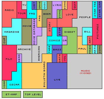
Yahoo! is the undisputed king of the Web directories, providing one of the key information navigation tools on the Internet. It has maintained its popularity over many Internet-years as the most visited Web site, against intense competition. This is because it does a good job of shifting, cataloguing and organising the Web [1]. But what would a map of Yahoo!'s hierarchical classification of the Web look like? Would an interactive map of Yahoo!, rather than the conventional listing of sites, be more useful as navigational tool? We can get some idea what a map of Yahoo! might be like by taking a look at ET-Map, a prototype developed by Hsinchun Chen and colleagues in the Artificial Intelligence Lab [2] at the University of Arizona. ET-Map was developed in 1995 as part of innovative research in automatic Internet homepage categorization and it charts a large chunk of Yahoo!, from the entertainment section representing some 110,000 different Web links. The map is a two-dimensional, multi-layered category map; its aim is to provide an intuitive visual information browsing tool. ET-Map can be browsed interactively, explored and queried, using the familiar point-and-click navigation style of the Web to find information of interest.
Browsing for a particular piece on information on the Web can often feel like being stuck in an unfamiliar part of town walking around at street level looking for a particular store. You know the store is around there somewhere, but your viewpoint at ground level is constrained. What you really want is to get above the streets, hovering half a mile or so up in the air, to see the whole neighbourhood. This kind of birds-eye view function has been memorably described by David D. Clark, Senior Research Scientist at MIT's Laboratory for Computer Science and the Chairman of the Invisible Worlds Protocol Advisory Board, as the missing "up button" on the browser [3]. ET-Map is a nice example of a prototype for Clark's "up-button" view of an information space. The goal of information maps, like ET-Map, is to provide the browser with a sense of the lie of the information landscape, what is where, the location of clusters and hotspots, what is related to what. Ideally, this 'big-picture' all-in-one visual summary needs to fit on a single standard computer screen. ET-Map is one of my favourite examples, but there are many other interesting information maps being developed by other researchers and companies (see inset at the bottom of this page). How does ET-Map work? Here is a sequence of screenshots of a typical browsing session with ET-Map, which ends with access to Web pages on jazz musician Miles Davis. You can also tryout ET-Map for yourself, using a fully working demo on the AI Lab's website [4]. We begin with the top-level map showing forty odd broad entertainment 'subject regions' represented by regularly shaped tiles. Each tile is a visual summary of a group of Web pages with similar content. These tiles are shaded different colours to differentiate them, while labels identify the subject of the tile and the number in brackets telling you how many individual Web page links it contains. ET-Map uses two important, but common-sense, spatial concepts in its organisation and representation of the Web. Firstly, the 'subject regions' size is directly related to the number of Web pages in that category.
Importantly, ET-Map is also a multi-layer map, with sub-maps showing greater informational resolution through a finer degree of categorization. So for any subject region that contains more than two hundred Web pages, a second-level map, with more detailed categories is generated. This subdivision of information space is repeated down the hierarchy as far as necessary. In the example, the user selected the 'MUSIC' subject region which, not surprisingly, contained many thousands of pages. A second-level map with numerous different music categories is then presented to the user. Delving deeper, the user wants to learn more about jazz music, so clicking on the 'JAZZ' tile leads to a third-level map, a fine-grained map of jazz related Web pages. Finally, selecting the 'MILES DAVIS' subject region leads to more a conventional looking ranking of pages from which the user selects one to download. ET-Map was created using a sophisticated AI technique called Kohonen self-organizing map, a neural network approach that has been used for automatic analysis and classification of semantic content of text documents like Web pages. I do not pretend to fully understand how this technique works; I tend to think of it as a clever 'black-box' that group together things that are alike [5]. It is a real challenge to automatically classify pages from a very heterogeneous information collection like the Web into categories that will match the conceptions of a typical user. Directories like Yahoo! tend to rely on the skill of human editors to achieve this. ET-Map is an interesting prototype that I think highlights well the potential for a map-based approach to Web browsing. I am surprised none of the major search engines or directories have introduced the option of mapping results. Although, I am sure many are working on ideas. People certainly need all the help they get, as Web growth shows no sign of slowing. Just last month it was reported that the Web had surpassed one billion indexable pages [6].
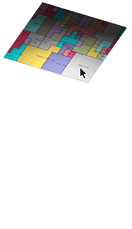
There are many other fascinating examples that employ two dimensional interactive maps to provide a 'birds-eye' view of information. They use various underlying techniques of textual analysis and clustering to turn the mass of information into a useful summary map (see "Mining in Textual Mountains" in Mappa.Mundi Magazine). In terms of visual representations they can be divided into two groups, those that generate smooth surfaces and those that produce regular, tiled maps. Unfortunately, we don't have space to examine them in detail, but they are well worth spending some time exploring. I will be covering some of them in future columns.
Copyright © 1999, 2000 media.org. ISSN: 1530-3314 |
||||||||||||||||||||||||||||||||||||||||||||||||||||||||||||||||||||||||||||||||||||||||||||||||||||||||||||||||||||||||||||||||||||||||||||||||||||||||||||||||||||||||||||||||

|