 |
|
|
||||||||||||||||||||||||||||||||||||||||
|
Mostly Cloudy, Clearing Later: Network Weather Maps
In sketches and diagrams the Internet is often represented by the graphic shorthand of a cloud. The Internet cloud is quick and easy to draw and useful to hide the complexity of the networks [1]. But how can one tell what is going on inside this cloud? Perhaps, extending the meteorological metaphor, we could use Net weather forecasts to show oncoming packet storms. Of course, maps are the key means of summarizing and presenting complex meteorological data. We are all familiar with the colourful weather maps on the TV news and on the newspaper back page, with their isobars and little symbols of snow flakes, raindrops and lightning bolts [2]. Are there equivalent weather maps for the Net?
Stormy weather in data networks takes the form of congestion and disruptions that slow downloads and break connections. If things get really bad, some parts of the Internet can, temporarily, become unreachable and one's connectivity be lost completely for a period of time. Many Internet networks operators, particularly those serving the research and education communities, provide summary real-time data on how their networks are performing. There are many useful metrics of performance and workload that can be recorded and charted to give an overall sense of the 'weather' in the network [3]. (Just like in meteorology, where there are many significant variables, such as wind speed, temperature and pressure that need to be measured and factored in to give a reliable overall forecast.) Key network performance metrics include availability (can I reach a given destination?), latency (how long does it take me to get to a destination and back again?), load (what percentage of link capacity is being used?) and packet loss (how many data packets being dropped by overstretched routers which cause them to be re-sent?). Also, the manner in which network measurements are taken can be divided into active and passive. The first of these involves sending small test packets out into the network monitoring their progress. The passive approach entails simply placing a measuring tool at a strategic location and counting the traffic as it flows naturally past. To return to the meteorology analogy, the conceptual difference is akin to the difference between rain gauges and doppler radar. One more important consideration is how many different locations should sample measurements be taken from in order to give a representative picture of network weather patterns. (See End Box: Some Net Forecasters for a range of useful Net measurement projects.) There are also some interesting attempts at visualizing summaries of performance on the individual links and switches of a data network. These visual interfaces are popularly referred to as 'network weather maps'. They are in some senses useful marketing as well as public-spirited information dissemination tools, providing network customers with potentially useful information, especially to identify trouble spots and unusual events. The maps are updated frequently using automated data measuring and processing software. They allow outside users a 'peak inside' the network with a summary of performance usually represented with links colour-coded by their traffic flows. Often, they also act as a visual interface allowing users to gain easy access to more detailed statistics available as tables and statistical charts by clicking on a particular link or router node. Clearly the level of detail shown in this public network weather maps often has to be limited for reasons of security and commercial confidentiality. In addition, most of those who are likely to consult these maps will only want a general summary view of the network and are not interested in, or would not understand, more detailed performance data. There are quite a number of different network weather maps online. Here we look at two particularly good examples, for networks in the US and in Scandinavia, which illustrate well this genre of mapping.
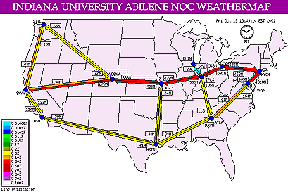
This map shows the weather on the Abilene network. This network is currently the core of Internet2, providing the very high-speed Internet backbone for the research and education community in the US [4]. The network links of Abilene are plotted as large arrows connecting the nodes on a simple geographic base map.
The Abilene weather map was created by Mark Meiss and is maintained as part of the NOC for the network provided by Indiana University. It provides the public with a nice high-level summary of the network in a single image. The map is dynamic, being automatically updated on every five minutes. The arrows, representing the network links, are split into two, with each half showing the traffic load in one direction. The colour coding is according to a graduated scale using an intuitive 'cool-to-hot' scheme, as set out in the legend. So if you see a lot of red arrows on the map, this indicates that the links are running 'hot' with high traffic loads, which in turn may be an indication of performance problems for users (packet loss and longer latency) caused by some kind of technical problem or abnormal traffic demands. The small boxes adjacent to the arrows indicate the absolute volume of traffic flowing over the link in the previous five-minute polling period. The core routers of the network are shown by small blue circles in their approximate geographical location. Clicking on an arrow, or router circle of interest, will open a new web page with more detailed statistics presented in charts. The map is created automatically using custom software. The underlying data is gathered and processed with the widely used utility software called MRTG � Multi-Router Traffic Grapher [5]. Other notable examples of similar geographic network weather maps include one for the Greek research and technology network, GRNET; the new pan-European very high-speed G�ANT network; the CESNET2 load map showing the Czech research and education network; and the UNINETT network in Norway [6].
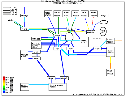
Our second network weather map example is more of a wiring diagram than a conventional geographic map. It shows the traffic load for the network links of NORDUnet, the research and educational backbone serving the Scandinavian nations [7]. The map was developed and is maintained by Havard Eidnes at the NORDUnet information center.
The aim of this weather map is to show in a clear diagram the aggregate daily traffic load on the links in the network as well as acting as a visual index to more detailed traffic statistics. The colour coding of the lines denotes the percentage traffic load for the day, in ten percent classes, as specified in the legend. Dark blue links had a traffic load of only between 0 and 10 percent, while the most congested links, coloured dark red, peaked at 90 percent or more traffic load. The links are divided into two segments, with the segment closest to the node representing outgoing traffic for that node. The bandwidth of individual links is represented by line thickness. There are other weather maps that use a logical layout to display the network, for example the one for the pan-European research and education Ten-155 network. The Ten-155 weather map is provided by the DANTE operations group, based in Cambridge, England and it shows average traffic in the core mesh of network links in the last two hours. The aim of the map is to "give an immediate visual indication on how traffic is flowing." [8].
Given the size and complexity of the Internet, the 'weather' is pretty good most of the time. Of course, performance, as perceived by end users, varies but it is a remarkably robust system. It is unclear how useful network weather maps really are beyond simple curiosity about how a particular network is running. And, of course, none of these maps gives a predictive, forward looking forecast; they simply summarise current and past performance. Most of the network weather maps are also limited to a single network � somewhat akin to regional forecasts � and probably only of interest if you happen to be on that particular network. Despite these limits, they represent a start of a more comprehensive public weather service of the Net, revealing something of the ever-changing weather inside the Internet cloud.
Copyright © 1999-2001 media.org. ISSN: 1530-3314 |
|||||||||||||||||||||||||||||||||||||||||


|