 |
|
|
||||||||||||||||||||||||||||||||||||||
|
World Wide Wunderkammer A metaphor for mapping social spaces.
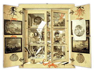
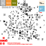
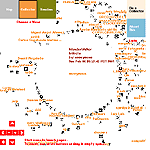
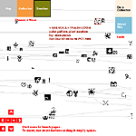
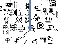
The wunderkammer was partly a manifestation of the inevitable urge to collect. (For a fascinating look at the mind of the collector, we highly recommend Bruce Chatwin's Utz; for an equally fascinating look from the point of the view of the collectee, you can't do much better than Tibor Fischer's The Collector Collector.) But, as digital artists Marek Walczak and Martin Wattenberg realized, the wunderkammer is more than a collection. The cabinet of wonders is a way of placing objects next to each other to evoke memories, a cabinet of hyperlinks to a broad set of visual associations. To these artists, the wunderkammer flows directly from devices such as the memory palace, a visual structure in your head you use to store and (most importantly) recall memories. In their new project, WonderWalker: A Global Online Wunderkammer, Walczak and Wattenberg apply this old metaphor to the Internet. The results are fascinating. WonderWalker is a visual map of icons. People create icons and lay those icons in a place that is appropriate on the map. This collective wunderkammer uses space to find things: you look for something that is related, then place your icon next to it. In a technical tour-de-force of java programming, this snappy interface can quickly switch from a spatial view to a timeline, showing which objects were placed when, or to an author-based view. WonderWalker takes the wunderkammer concept of the collection of curiosities and applies it to the net to create a new kind of social space.
Social spaces are the subject of an ongoing inquiry on the net. In Map of the Month (February 2001), Martin Dodge investigates Netscan, a project that attempts to divine the social space inherent in Usenet News. In WonderWalker, the artists treat the entire web as a database and, instead of trying to use the structure of the underlying links to divine social spaces, they invite humans to create the space through their placement of icons.
An interesting and in-depth exploration
of the wunderkammer metaphor is provided by Shiralee Saul in her
Information Tsunami Wunderkammer.
In an accompanying essay,
she explains how she views the Internet as a vast place to explore and her computer as the
place to bring back links to store in her own digital wunderkammer:
The web site as wunderkammer, a collection
of curios (links), is an analogy that has not escaped those studying the rise in popularity of the weblog.
In Feed,
Julian Dibbell's Idée Fixe, views the
phenomenon through Proto-Blogger John Barger's website as a cabinet of wonders. He depicts a network slowly evolving from
its primordial beginnings into a more advanced museum age, not unlike the unexplored landscape envisioned by Ms. Saul:
Essentially any collection of links can be considered a wunderkammer when viewed in this context, but
what makes the WonderWalker so intriguing
is the combination of the high concept of the wunderkammer with the careful execution to
create a shared social space that works. This is certainly an experiment worth tracking, perhaps
even adding a link into your own personal cabinet of curiosities.
Mappa.Mundi: WonderWalker is a fascinating mapping paradigm in a 2D space. How did your background in 3D visualization help develop the concepts in this project? In your opinion, did a 2D representation prove to be more or less successful? Marek Walczak: Actually the ideas were based on my architectural education in London by people like Cedric Price for whom architecture is a kind of temporal resource for human engagement. I think that form of thinking, inbred for years, is what fascinates me about this work, that we can create dataspaces that easily interact and can be shaped by the person using it. In this case the 3rd dimension is Time.
Say there are at least two interactive states: There are some of a “fixed” type which exist across the screen and in time, but whose actual potential growth is known—like many Java painting toys, etc… There are others that are “open” where there is an unpredictability in their development. I think that's why its so much fun to see maps of people-organized virtual spaces. Mappa.Mundi: In your interview with Gallery 9, you make this observation on your collaborative working process with Martin Wattenberg: “In everything we do you see a fraction of what we thought had potential.” Martin goes on to say, “it is a particular constellation from a very large sky.” What are a few of the ideas that didn't come to fruition? Was it due to limitations with current technologies, or was it a creative decision? Marek Walczak: It's more like having a ferment, a fire of ideas that we can draw from. We looked at “trails” the idea that people leave markers as they navigate the WonderWalker/web. Also we had this idea of visualizing multiple search criteria as a kind of cubist map, where the size of each “chamber” corresponded to the importance of a parameter. Then we fixed on people making their own icons, and they became the focus of the map. Mappa.Mundi: Do you envision WonderWalker scaling to encompass larger spaces? Marek Walczak: The most open part of the WonderWalker is that we haven't decided yet what to do as it gets larger. Well, we have several ideas, but we are waiting to see how the map grows. Stay tuned!
Marek Walczak: As part of the months spent creating the WonderWalker we looked at every type of mapping visualization we could find. What's interesting is that since then I haven't gone back to them. And I think of myself as a visual guy. The “social” example everyone nods their head to is Amazon: you go there, they tell you of things on sale similar to what you bought before; every item is reviewed both by “writers” and anyone; the reviewers are themselves reviewed; they tell you what books other people have bought similar to the one you are browsing on etc… Sorta kinda like going to your friend and saying “seen a good movie lately?” By nature we are social animals, we make judgments not by tags or how well things are mapped, but by the social network we build around us. From this network, perhaps, we establish a sense of self. Now the trick is to tap into the natural tendency of a social person to accept a different network—which is why everyone nods their heads when you mention Amazon. Mappa.Mundi: Recently antarcti.ca was released, a visualization of The Open Directory Project (DMOZ) mapped onto the surface of Antarctica. It uses two types of visualization, 2D maps (that are similar in technique to Martin's work on SmartMoney's Map of the Market), and 3D maps (that use an architectural metaphor, a common theme in your work). Does it succeed in either of these metaphors? Marek Walczak: SmartMoney's Marketmap is very specific, it colorfully maps the changes of stock values over time, using a farming field-like analogy. When you look at it, it's like a “gestalt” image, you see the changes instantly. That's why it's so useful and popular. The Antarctica map simply isn't as immediate, and so therefore perhaps not as useful? Wait, a couple of times I used WebBrain, but then I was “surfing” and was interested in the complexity and depth of the links, and what unusual item they may dredge up—I wouldn't use it as a search tool. Have you? Mappa.Mundi: At a fundamental level, DMOZ is a “social space” as it relies on the input of users and the expertise of human editors to keep its data current. How could a visualization of DMOZ enhance it's inherent qualities as a “social space?” Marek Walczak: It's “social” in the most basic sense, like Google (don't get me wrong, Google is great). Think of it in human terms, its like receiving a list of favorite movies from all your friends and relatives, all in plain text format and unsigned. So I guess I'm saying that, way before we even get to 3d visualization, 2d mappings rarely work. Everyone eulogized the Visual Thesaurus when it first came out, including me, but I never use it. The trick I think is to layer a more profound socially interactive space with those visualizations. Where 3d visualization can help is not as a mapping/search facility but as an aid to memory. Just as in the Memory Palaces that were used as mnemonic devices in the past, highly sensory stimulating spaces can help “fix” a person's memory of a site. In our next project called Apartment we already see that the immersive environment created by simply typing in text creates a very interesting phenomenal effect. And that I hope will prove useful.
|
|||||||||||||||||||||||||||||||||||||||
|

